Wine Importers - Branding
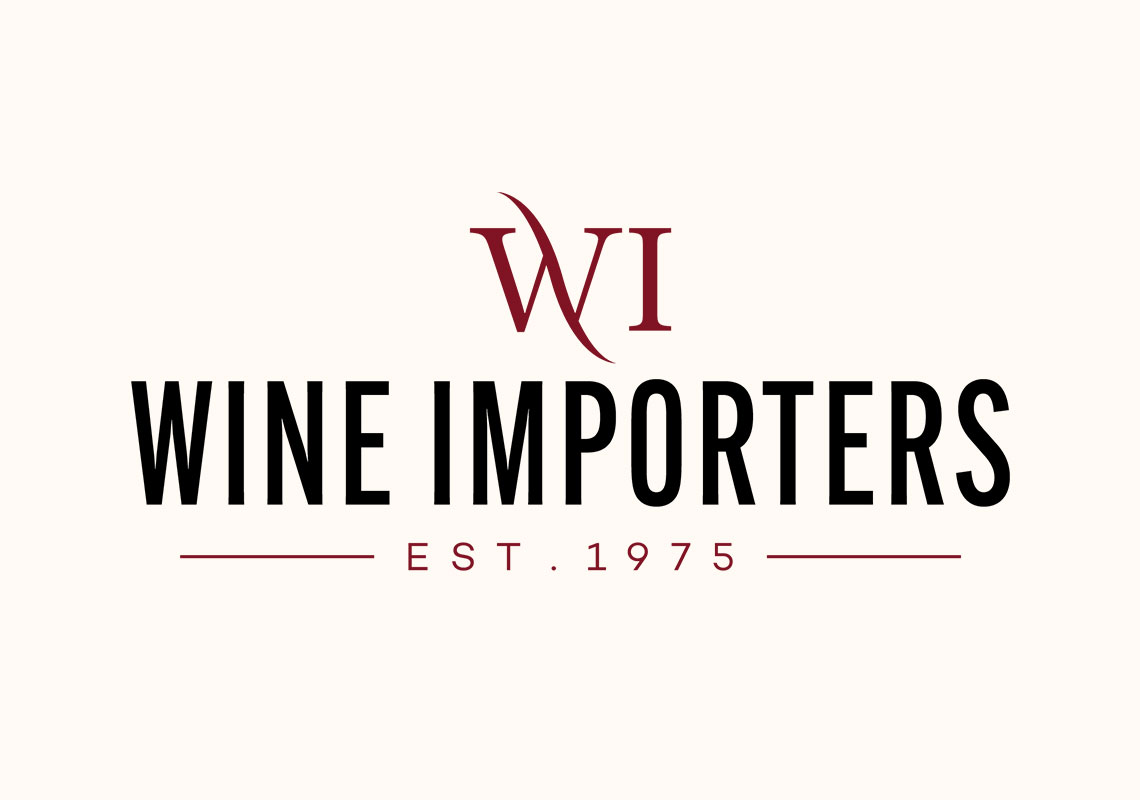
The logo for Wine Importers is a sophisticated and modern redesign that reflects the quality and expertise of the brand. The use of a rich burgundy palette for the logomark evokes the deep, luxurious tones of fine wine, aligning perfectly with the company’s industry and heritage.
The logomark features a clean and impactful “WI,” crafted with simplicity to ensure recognizability and versatility. This bold design establishes a strong visual identity while maintaining a refined and timeless aesthetic.
To further enhance the sense of sophistication, the logo is stacked vertically, creating a structured and elegant composition. The modern font used for the main lettering adds a contemporary edge, ensuring the brand feels fresh and relevant while appealing to discerning clients and partners.
This updated logo positions Wine Importers as a modern and forward-thinking company, seamlessly blending tradition with contemporary design to convey quality, expertise, and excellence in wine importation.

All content © William Arbuckle
Follow us:
Client Comments
"We have selected the first logo Design [in the proposal document] and will run with that. So task completed!" - N. Renton