Project Heating - Branding
Project Heating were looking for a modern, minimalistic logo design for their new company's branding.
Intially a more traditional/classy look was requested but during development it became clear that a tweak towards more of a modern design would be a more appropriate route to take.
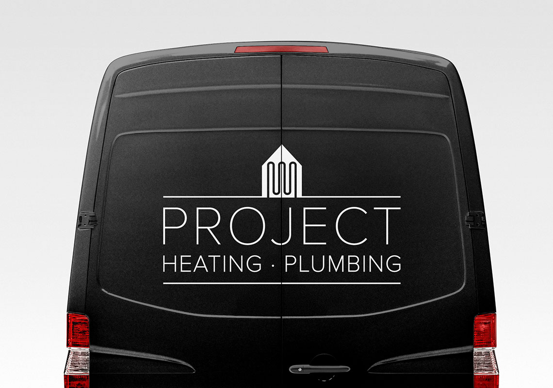
In the end, the 1 colour design was created using a modern sans-serif font paired up with a symbol which represents heating within the home.


Client Comments
We have a winner! I love this design, a mix or traditional and modern. Simple, effective and it really stands out. - J. Davidson