Love Garden Services - Branding
Love Garden Services got in touch looking for help with designing a logo for their garden maintenance company. They had been doing it for a few years and now felt it was time to concentrate on branding.
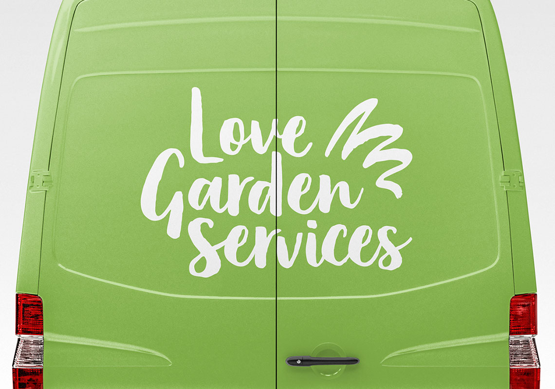
A really approachable, friendly design was developed which is particularly suited to the gardening sector. Another reason to go with this lettering is just how well the letters organically fit with one another. This is often not the case when attempting to arrange text and shouldn’t be overlooked. You can see how this, in a manner, mirrors the natural world and how plants naturally grow, shape and conform together.
The symbol is integrated as it grows out from the end of ‘services’ creating a cohesive design. The stem has been cut halfway up to emphasize the leaf/love-heart portion of the symbol. Infact, the loveheart/leaf symbol is quite a forunate occurance. It could be seen as quite an obvious idea, but when a design comes together, so easily, so trouble free- it’s a sign that everything is working in harmony.


All content © William Arbuckle
Follow us: