Hebridean Holidays - Branding
Hebridean Holidays were looking for a logo to front their Scottish vacation company.
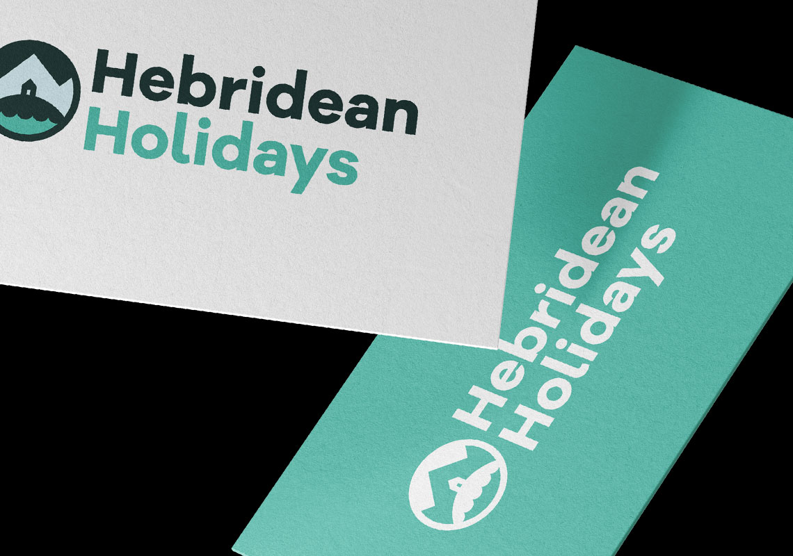
Friendly yet thick lettering was utilised to make the mark stand out. The symbol incapsulates the Hebridean getaway with a little holiday home on a wee hill beside the sea and a mountain behind. The colouring looks great in a dark green and turquoise colour palette as well as being flexible and working well in 1-colour variants too.


All content © William Arbuckle
Follow us: